Colour Theory

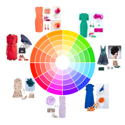
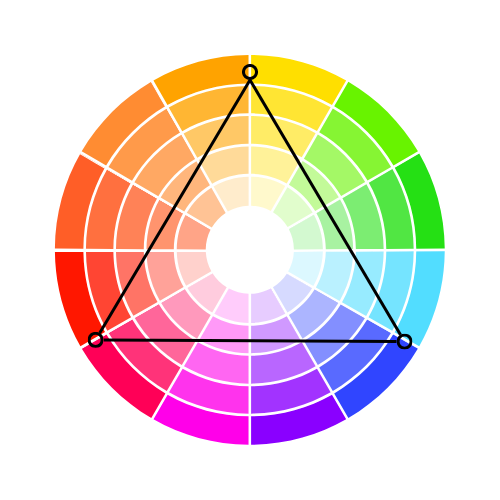
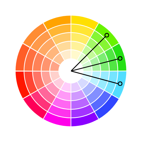
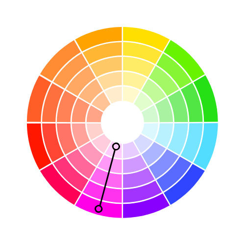
Colour theory in fashion is the concept of combining colours in a way that is visually appealing and harmonious. At its core, the colour wheel helps guide these choices by showing the relationships between colours. The wheel is divided into 12 colours, including primary (red, blue, yellow), secondary (green, orange, purple), and tertiary colours, which are blends of the primary and secondary shades.

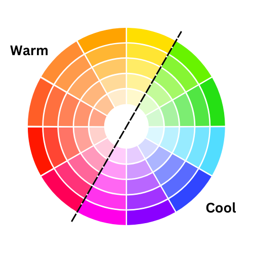
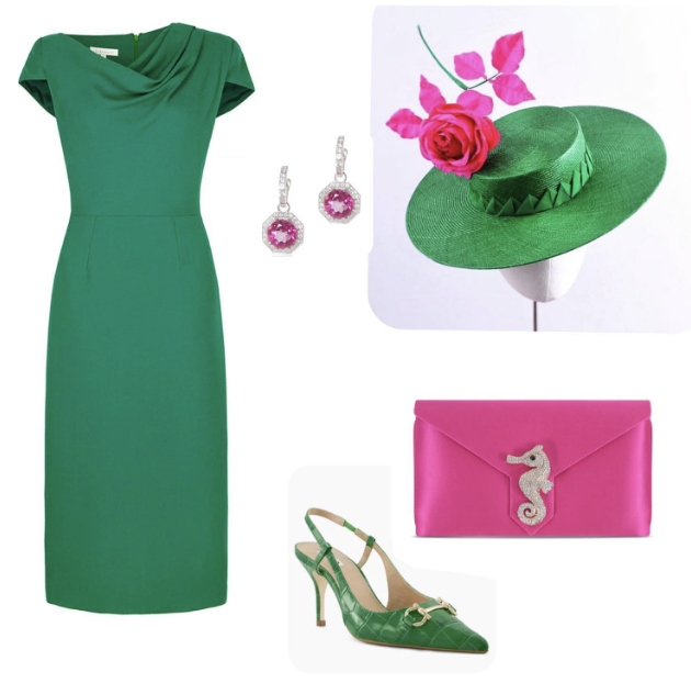
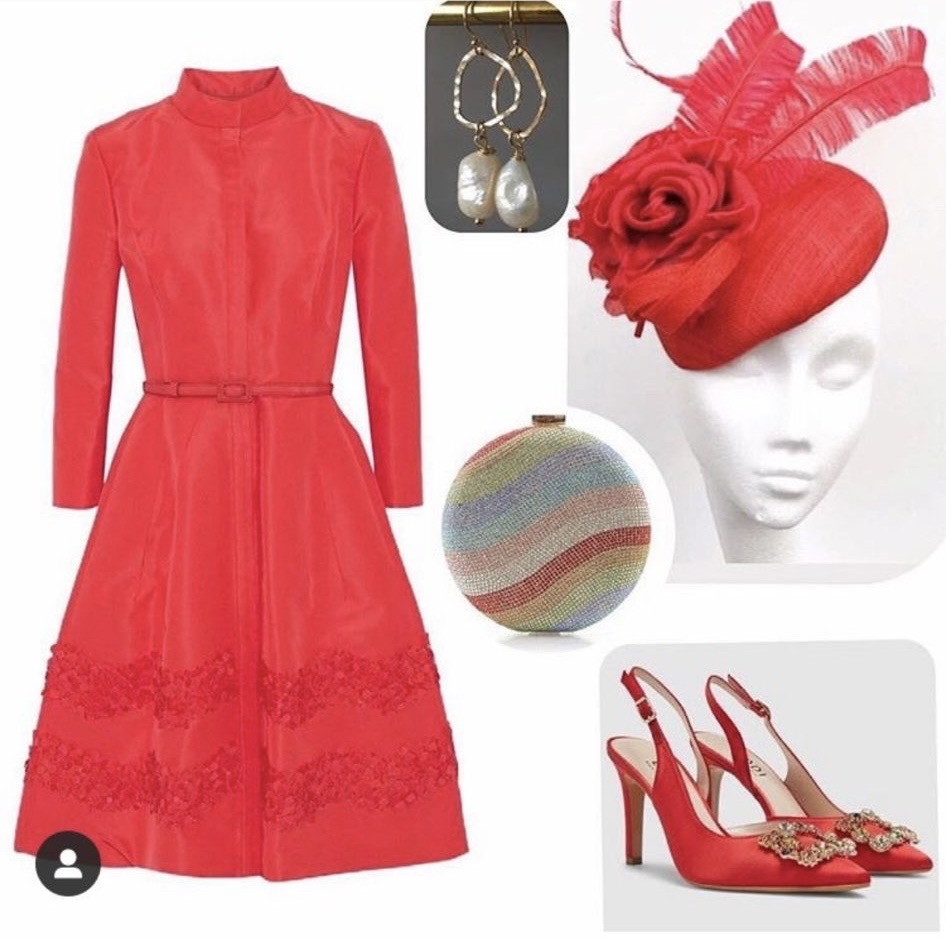
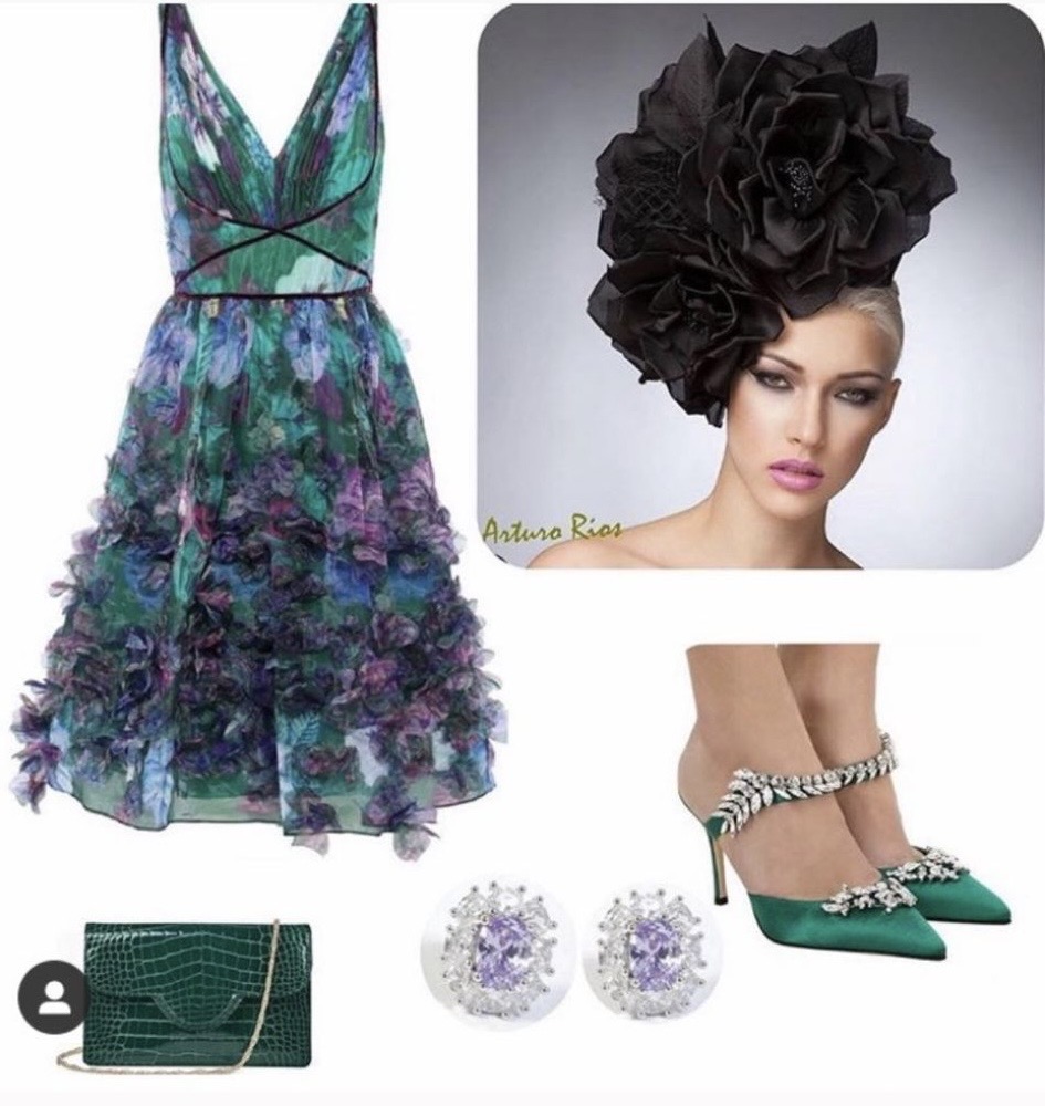
In fashion, understanding warm and cool tones is essential. Warm colours like red, orange, and yellow convey energy and vibrancy, while cool colours like blue, green, and purple are more calming and subdued. Complementary colours, found opposite each other on the wheel (like red and green), create strong contrast, perfect for bold outfits. Analogous colours, which sit side by side (like blue, green, and teal), blend smoothly for more cohesive looks.

Using colour theory, you can create balanced, eye-catching outfits by playing with contrast, harmony, and mood. Whether you’re dressing up for a bold statement or a more subtle ensemble, understanding the basics of colour theory helps you make confident fashion choices.

The skin you're in

Skin tone is a key factor in determining which colours will flatter you the most. The undertones in your skin—whether warm, or cool – can either be enhanced or diminished based on the colours you wear. 

Wearing colours that complement your natural undertones can brighten your complexion, making your skin appear healthier and more radiant. While the wrong colour tone can make skin look washed out or dull. 

Understanding how to match colours to your skin tone helps you make fashion choices that highlight your features and give you a more radiant look.

Combinations

Warm & Cool Colours

Warm & Cool colours

Get the look

Split Complementary Colours:
This involves selecting the two colours adjacent to the complementary shade on the colour wheel. For example, pair orange accessories like earrings with a navy or plum top. For a more understated effect, try adding a saffron-coloured scarf to a muted purple t-shirt or sweater.

Contrasting Colours:
Experiment with bold pairings such as red and green, blue and orange, or purple and yellow. To create a harmonious balance, let one colour take the lead, covering about 70% of the look, while the contrasting hue serves as an accent (30%).

Accessorise:
Coordinate your handbag with your shoes or outfit for a polished finish. Gold jewellery complements warm tones like yellow and orange, while silver or platinum is ideal for cool colours such as blue or violet.

Complementary Colours

This is two colours which are on opposite sides of the colour wheel. This combination provides a high contrast colour combination, these colours will appear bright and more prominent.

Complementary colours

Triadic Colours

This combination of three colours are evenly spaced on the colour wheel. This combination creates bold, vibrant colour palettes.

Triadic colours

Analogous Colours

Analogous colours are three shades located next to each other on the colour wheel. This combination is flexible, but can feel intense. To create balance, select one colour as the main focus and use two for accents.

Analogous colours

Monochromic Colours

These are 3 shades and tones of one base colour. They provides a more subtle colour combination. These are versatile colour combination.

Monochromic colours

All inspired?  Nows the time to view the collection!

Scroll to Top

Enquire

To enquire about this product, complete the form below.

×